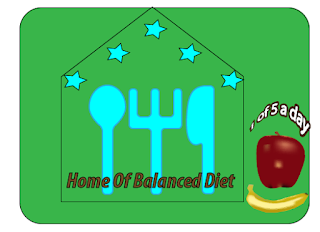
Where do I start from? Apple or banana?
Okay, let me explain the Apple first.
For the Apple, I got the image from the internet, placed it on the adobe illustrator using place from file menu. I put that on layer 1 and used toggles lock to lock it. Then created another layer for my work of art.
To draw the apple, I used pen tool to trace out the edges of the image of the apple I got earlier (filled with white colour), then used direction selection tool to make adjustment where necessary. Which gives me new image shown on the right.
Then I used mesh tool to draw lines on the traced out to give me the idea of where to apply the colour on the apple. I did same for the tiny head of the apple to get the shape and placed on the main body separately and used group from the object to group them together. I then dragged the selected new shape out, ready for the filling of the colour of the apple.
Then I used eyedropper tool to select the main colour of the apple and dropped it on the new image of the apple. By clicking on the anchor points one after the other where necessary, I was able to fill in the 3D colour on the apple and the dark base colour.
Almost same process was used for the banana except that I used ruler guide to know where to put my rectangle shape to be able to get the real curve shape of the banana. After which the same process of mesh tool was applied.
For the text on the company logo, I used myriad pro using text tool. After writing the text I used expand from object and default fill and stroke. Selecting the text again, I clicked on object > path > offset path to change the setting to 8px and miter limit to 4 then click okay. Miter limit is used to control how pointy the segment look when they are joined. I tried to preview to see how my text was affected with the change of numbers before I finally decided to use 8px for offset path and 4 for miter limit.
After, I clicked on window menu > pathfinder > unite, to create a compound text. I then right clicked, clicked on arrange and chose send to back after which I filled the back with the colour of my choice. Finally I clicked on object > envelop distort > make with wrap and adjusted the bend to 50%, horizontal to 47% and the vertical to 10% to achieve my final text below:
I was able to do all this with the help I got from watching some illustrator videos on youtube and linda.com.


No comments:
Post a Comment