Wednesday, 29 March 2017

LOGO USING PHOTOSHOP


For the love shape, I used adobe illustrator. Rounded 

rectangle with the width set to 29.99, height 15.58,

round corner 10, I made a shape then copied to 

make another of the same size. Placed them vertical 

and horizontal on top of each other as seen here.


Rectangular tool was used to draw a rectangle at the 

base of the love to give it a pointed base as seen. I 

used adobe illustrator so as to be able to edit it 

without it losing it's value.


Selecting them together and using unite from 

pathfinder I was able to get a love shape. Then 

repositioned.


Next is copied and paste from illustrator to Photoshop then merged with the written text. I first placed the love shape parallel in between the text but did not look good to me so I decided to place it vertically with the text then merge together.

To make a complete logo, I placed the merged text with the shape on a blue background then got the cutlery image from the web (http://static.petersofkensington.com.au/images/ProductImages/465839-Zoom.jpg) and placed beside the text after resizing.

Friday, 24 March 2017

GRADIENT/BLENDING


This image on the right was achieved in class. So I thought I should be able to do it on my own. Which I give a go.


Got the two pictures I intend using to practice how to use gradient tool. I used polygonal lasso tool to select the man, copied and paste on the car I intend using. The man picture was very small with these measurements: W=19.23cm, H=11.29cm, X=25.65cm, Y=17.64cm so I increased it to: width=32.14cm, height=20.88cm, X=37.29cm and Y=20.74cm. X and Y are for the position while width and height are the size of the picture.  I used this measurement seeing that the man’s picture is big enough to be used without losing or causing the picture to lose its quality.


Clicking on create new fill or adjustment layer on the right hand side bottom gives me assess to gradient. The opacity was set to 45%, fill 37%, density 43%, feather 2.8px, for  blending mode for the layer I used "subtract" because it gives me the image I like, for pick a filter type I decided to leave it on "kind" after browsing through all. The image is what I was able to achieve. 

Thursday, 23 March 2017

TEXTING (CONTINUATION OF BLENDING)

    The next thing I will be trying to do is to 

change the yellow painting on the UCP building 

(wall and edge) to my desired colour and write 

using text tool on it. 


     I used quick selection tool to select the area I 

will like to change its colour and filled it with 

colour of my choice using brush tool to achieve 

this image. 


     For the text, after clicking on the text tool, I chose Myriad Pro as text style, 14% as font size then filled with the colour of my choice. I think of using 3D for the text.  I then right clicked on my work layer, clicked on the new 3D extrusion from selected layer. I used the shape Preset on the right side of the Photoshop to select the shape I wanted. I actually browse through all to see the effect on the text before I finally decided to choose inflate then adjusted the text by using extrusion depth which was set to 2cm after checking how the text look like using different figures.


     I played around the text to check how the top, back and sides look like before leaving it on default. I filled the front with fun textured 2(red), reflection was set to 38%, shine 5%, roughness 22% and bump to 10%. Filled the side (pro extrusion material) with fabric denim, back inflation with fabric leather (brown)


     Finally, I clicked on the background layer to 

achieve this image on the right.


Before I was able to achieve the writing on the wall above, I tried some writings to see how I can do it on the wall. These are the practice I did before doing it on the wall.


Before I was able to lay my hand on the writing, I watched tutorial on youtube so as to be able to get how to do the text.

The link to the youtube I watched is given below:
https://www.youtube.com/watch?v=PS-S45Xt-NU


BLENDING (UCP BUILDING)

 I opened a UCP building picture which I want to add 

rough/dirty wall to its’s side (blend). Then opened 

another picture (grungemap) which will be the 

rough wall. I tried to move the rough wall by 

dragging it to the UCP picture page but was unable 

to.


I then selected it, copied and pasted it on the UCP picture to achieve this picture

I selected the rough wall then checked the show transform controls on the menu bar to resize the wall to fit the side of the building picture after which I reduced the opacity to 59% to be able to see through.


Then, I clicked on switched between free transform and warp modes on the task bar to be able to resize to fit in the side of the building wall. When I can see that it fit perfectly well, I checked the tick sign beside the free transform and warp mode to achieve this:  

SELECTION TOOL FIRST PRACTICE

This is my first work on how to use selection tools. It was hiding somewhere, just dig it out and thought it will be good if I post it.

After uploading the picture from VLE to the photoshop, I then used polygonal lasso tool to select the building in the first picture. Although other selection tools were tried, but I finally decided to use polygonal lasso tool because it's a bit easier for me to use.


 After, I copied the picture and pasted it on the second picture (using the second picture as background) to achieve the third picture below. . 

Tuesday, 21 March 2017

NEW PICTURE TO OLD TRANSFORMATION


I opened a picture I wanted to transform.  Clicking on create new fill or adjustment layer which is on the bottom right of Photoshop, I was able to click on hue/saturation which allows me to adjust the picture. I checked the colorize colon then adjust the hue to 30, saturation to 20 and lightness to 3, I was able to achieve this picture. 


The original picture that was transformed is the one on the right hand.

HUE/SATURATION (Another method)


Just being curious and thinking there should be another method/way of using Hue/Saturation. I started surfing the internet (youtube to be precise) and was able to know how to go about it using another method.
The picture on the right hand side is the original tulip picture I considered which was downloaded from VLE. (Recommended by the lecturer).


Clicking on create new fill or adjust new layer at the right hand side bottom of the Photoshop, I used the quick selection tool to select the part I will like to apply the colour to. After, I checked on the colorize icon on the right hand side in the hue/saturation then adjusted the lightness to -45, saturation to 46 and hue to 308, I was able to achieve this picture on the right hand side. 

HUE/SATURATION (TULIP FLOWER)


Following the method taught in class, I used hue/saturation to change one of the tulip flower colour. By clicking open in file and choosing the tulip image then clicking on create new fill or adjust new layer at the right hand bottom of the Photoshop, I was able to select hue/saturation. Then, adjusting hue to -43 gives the tulip red colour. 


Using brush tool and putting in mind that black colour conceal while white reveal, I was able to use black colour to conceal most of the red colours to reveal the original colour of the tulip flower and leave just one flower to be red.


Wednesday, 15 March 2017

NEW PENGUIN

I actually tried another Photoshop with the penguin. This time around I added a man walking. I used polygon lasso tool to select  the penguin and the man and placed on the background. I am satisfied this time around with the penguin shape. I used opacity of 61% for the moon. I also set the brightness to -40% because I wanted it to look like it was getting to evening. Contrast remain at 0. This is the image I finally come up with. Although the moon I used was very tiny, in the process of trying all the icons I was able to enlarge it but forgot what I did to enlarge. I remember I adjusted the width and height but can't remember to what figures. I tried to use create new gradient map adjustment layer but did not like what I saw so I left it looking like this picture below.


FIRST PHOTOSHOP

 This exercise was done in class. First time ever I
 will use Photoshop. Hmm... not bad though.
The two images was gotten from the internet. What I was to do is to move the penguin from the second picture into the first picture using lasso tool.

.

First thing I did was to click on the lasso tool and clicked polygon lasso tool to see how it will work for me. I used the polygon lasso tool to select the first two penguins one after the other by clicking and dragging the cursor to get dotted lines for the selection. When the line meets, that is, when I got to the starting point, the dotted line automatically joined and it was visible with the way the dotted lines were shaking.I then dragged the image onto the first image that is meant to be the background.


Now, this is the new image I got. I added moon to the background image to give it an evening look. I actually adjusted the moon shade by using brightness/contrast icon on the right hand side of the adobe Photoshop.

I am not fully satisfied with the shape of the flying penguin's head (not a smooth head from my selection) and I decided to do it again and correct myself to see if I will be better.
Until then, bye.


INTRODUCTION TO PHOTOSHOP

INTRODUCTION TO PHOTOSHOP
  

   DEFINITION: Photoshop is a brand name for computer software used to digitally alter digital photographs or other photographs. The definition is gotten from dictionary.com.
Why Photoshop? Photoshop creates an artistic virtual studio. Adobe Photoshop is a standard tool commonly used by experts for digital imaging. Image of a person or thing says a lot more about it than can ever imagine.  Learning Photoshop is a good way to learn imaging concept.  Below are the lists of the basic tools in Photoshop and what they are used for.
  
  MARQUEE TOOL: since in Photoshop the images are saved in pixel, marquee tools are used in selection of the images. Marquee tools are rectangular, elliptical, single row or single column marquee.
    
  Rectangular Marquee tool allows one to easily draw selections based on simple rectangle or square shapes. Rectangular marquee is used by selecting it and placing the cursor somewhere in the upper left and drag the mouse. The selection will be seen expanding as it is dragged towards the centre. When the rectangle has covered the area wanted in the image, the mouse button can then be released. By clicking and holding the selection in the middle and moving the cursor, one will notice how the selection is moving along with the cursor. This is used to copy and paste images, move images and apply filters to it.
   
  Elliptic Marquee tool: This tool extends our selection possible with the use of oval or circle shapes. It does the same as the rectangular marquee tool.
   
  LASSO TOOL: Lasso tool is also used for selection like marquee tool. However, with Lasso tool, one can make freeform selection. Lasso tools include polygon lasso tool and magnetic lasso tool.
    
  Polygon lasso tool: The black arrow on the top left is where the click point is. Click once on the image, move the mouse around the image and click through the area you wanted. As you move the mouse, the starting point remains pinned and a dashed line extends towards the cursor. When the starting point is reached and the selection is complete, one is now ready to copy the selected image.
   
  Magnetic lasso tool: Click and hold the mouse button with the cursor pointing at the image, drag around the image slowly. Notice as you drag, the selection snaps to the image as you move.

  NOTE: To cancel any selection, control D or escape key can be pressed.
   
  CROP TOOL: When crop tool is selected, you will notice small handles on the corners and on the edges in the centre of the image. To crop an image, either drags the handle to surround the part of the image to keep or click and drag inside the image to draw the area to crop. This can be adjusted by clicking and dragging the corners to resize the area wanted.
   
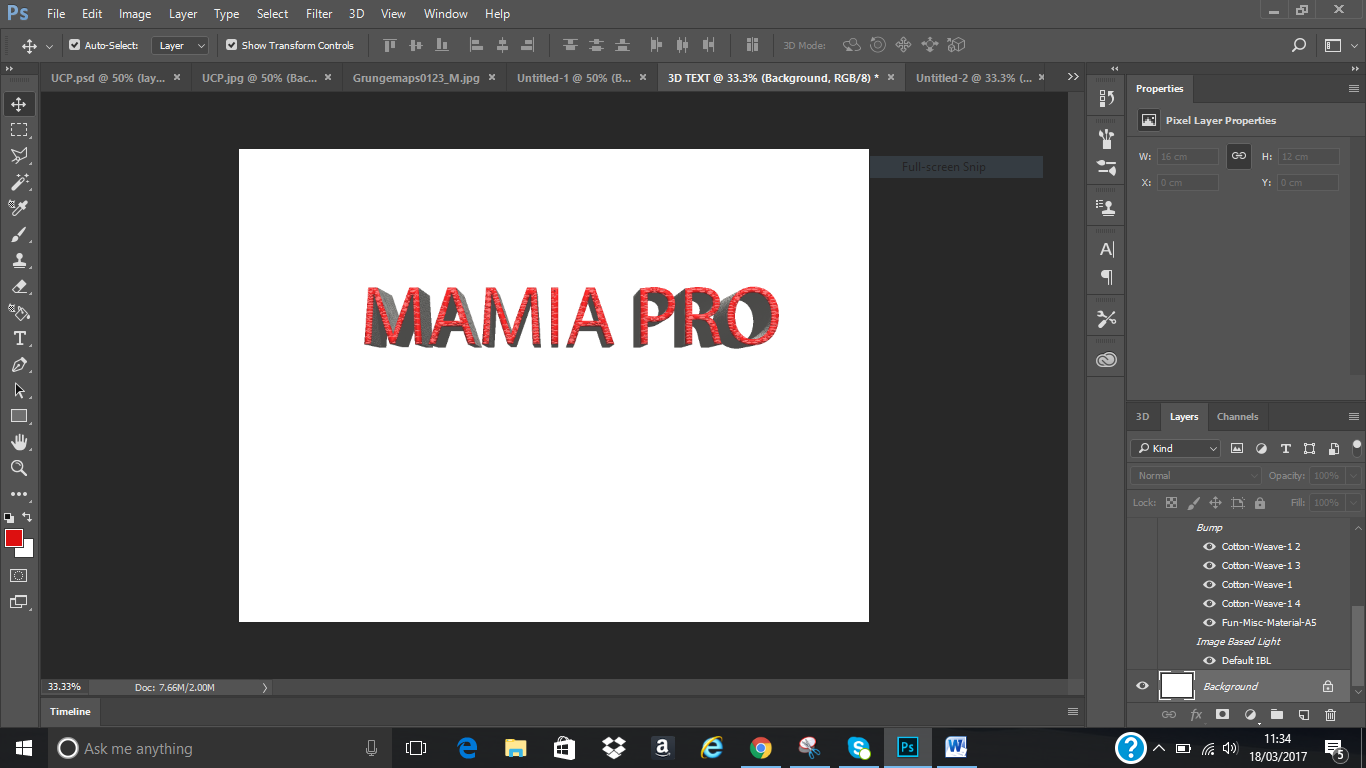
  TEXT TOOL: This tool is used to write text to describe the image. To adjust/edit the text from the menu bar; font family, font style and font size can be used as desired.
    
  BRUSH TOOL: The brush tool consists of pencil tool, color replacement tool and mixer brush.
   
  Pencil tool is used to draw lines of varying thicknesses
      
  Colour replacement as the name implies is useful for replacing color with another colour.
    
  Mixer brush mixes together different colors.
    
  SHAPE TOOL: This consists of Rectangular tool, Rounded Rectangle tool, Polygon tool, Line tool, Ellipse tool and Custom Shape tool. Shape tool is used to draw shapes with desired sides.
    
  GRADIENT TOOL: This comprises of gradient tool, paint bucket tool and 3D material drop tool. Paint bucket tool help to fill any given area with the colour of choice. Gradient tool allows the use of 2 or more colours for smooth blending.
    
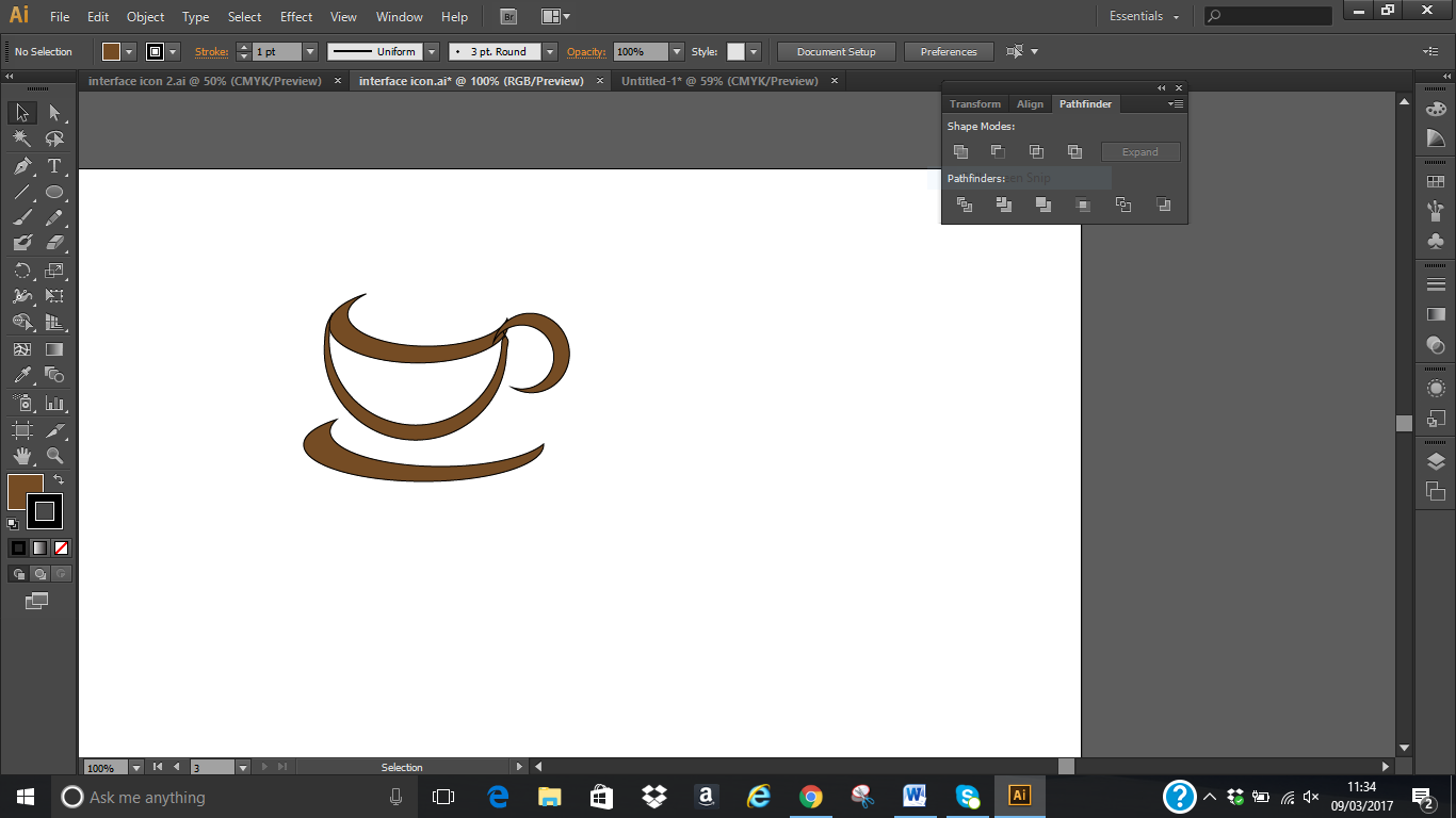
  PEN TOOL: This is made up of pen tool, freeform tool, add anchor point tool, delete anchor point tool and convert point tool.
    
  Add anchor point tool: This tool is used to add anchor point to an image when necessary.
    
  Delete anchor point tool: This tool is the opposite of the add anchor tool. It is used to delete unwanted anchor point in an image.


Thursday, 9 March 2017

INTERFACE ICON

For the interface, I arranged each of my drawings on individual background then put together on a background and grouped together to achieve the interface.

DRINK

For the drink, I used ellipse to make an oval shape with brown filled colour. Clicked on select then edit > copy > paste in front, set the two oval shapes over each other, select the two and used minus front from pathfinder to make it a compound shape like a half moon.


Made another shape but this time around it was a circle. Clicked on select then edit > copy > paste in front, set the two circles over each other, select the two and used minus front from pathfinder to make it a compound shape. Then object > group to join them together. 


Another oval shape was made for the base following the same method. That is, Clicked on select then edit > copy > paste in front, set the two oval together, select the two and used minus front from pathfinder to make it a compound shape.


Same process was repeated for the handle and then grouped together to make it one. 

Wednesday, 8 March 2017

ICE CREAM

Now for the ice cream, I used rounded rectangle tool, picked the pen tool and drew two straight lines that cut the shape into three parts. After, I used window > pathfinder > divide to ungroup. Then filled each layer with the colour of my choice. Used the rounded rectangle tool to draw the stick and fill with lovely brown. After which I used pathfinder to unite them together with the brown stick and grouped together using object > group.


MEAL

For the chicken, I used ellipse to make an oval shape then used pen tool to draw the down part and unite from pathfinder to make them a compound shape. Filled with the colour of my choice from the colour pallet. Using the line segment tool, I drew three paths over the chicken then filled with colour of my choice. I chose black for the colour inside because it makes the chicken look defined to me.

To draw the tomato ketchup, I used ellipse tool and rectangle tool, put them on top of each other then used pathfinder to unite them. For the neck of the bottle I used direct selection tool to select then drag to shape it. for the zigzag line, I used line tool to draw line from one side to the other then clicked on effect > distort and transform > zigzag. I then set the size to 4px (absolute), Ridges per segment 14, points to smooth. I previewed to make sure I am satisfied then clicked okay after adding stroke colour as desired. Then copy the tomato and placed on the ketchup bottle then grouped them together.


To get the sausage, I used round rectangle tool, set the width to 60px, height to 127.1px and corner radius to 20px then filled with colour. I then used pen tool to draw the top and bottom tie and filled with colour. Drew 2 oval shapes using ellipse, insert them inside each other after filling them with different colours. Then arranged them together in the sausage and grouped.
  

FRUIT AND VEGETABLE


 For the tomato, I used pen tool to draw a round shape and filled with colour. Red was chosen because I wanted a ripe tomato. Used the same pen tool to draw the branches and filled it with green colour then arranged it on top of the tomato. After, I used group from object to group them together. 
For the watermelon I drew a circle using ellipse tool, using rectangle tool I drew a rectangle to cover half of the circle then selecting the circle and the rectangle and clicking on the subtract/minus front from the pathfinder I was able to remove half so as to get a semicircle needed. After, I made 3 copies of the semicircle, arranged them inside each other and filled each with the desired colour to make it look a bit real. For the seeds, I used ellipse and filled it with black to draw small oval shape and multiplied then arranged in the semicircle to complete the watermelon

Saturday, 4 March 2017

COMPANY LOGO

With my company logo, I just added fruits to the App logo to make it a company logo.

Where do I start from? Apple or banana?
Okay, let me explain the Apple first.
For the Apple, I got the image from the internet, placed it on the adobe illustrator using place from file menu. I put that on layer 1 and used toggles lock to lock it. Then created another layer for my work of art.


To draw the apple, I used pen tool to trace out the edges of the image of the apple I got earlier (filled with white colour), then used direction selection tool to make adjustment where necessary. Which gives me new image shown on the right.


Then I used mesh tool to draw lines on the traced out to give me the idea of where to apply the colour on the apple. I did same for the tiny head of the apple to get the shape and placed on the main body separately and used group from the object to group them together. I then dragged the selected new shape out, ready for the filling of the colour of the apple.


Then I used eyedropper tool to select the main colour of the apple and dropped it on the new image of the apple. By clicking on the anchor points one after the other where necessary, I was able to fill in the 3D colour on the apple and the dark base colour.


Almost same process was used for the banana except that I used ruler guide to know where to put my rectangle shape to be able to get the real curve shape of the banana. After which the same process of mesh tool was applied.

For the text on the company logo, I used myriad pro using text tool. After writing the text I used expand from object and default fill and stroke. Selecting the text again, I clicked on object > path > offset path to change the setting to 8px and miter limit to 4 then click okay. Miter limit is used to control how pointy the segment look when they are joined. I tried to preview to see how my text was affected with the change of numbers before I finally decided to use 8px for offset path and 4 for miter limit.

After, I clicked on window menu > pathfinder > unite, to create a compound text. I then right clicked, clicked on arrange and chose send to back after which I filled the back with the colour of my choice. Finally I clicked on object > envelop distort > make with wrap and adjusted the bend to 50%, horizontal to 47% and the vertical to 10% to achieve my final text below:


I was able to do all this with the help I got from watching some illustrator videos on youtube and linda.com.

Friday, 3 March 2017

NEW LOGO/APP ICON


Hello, here I am again with new logo. I decided to change some things from the previous logo I made. Since the name of the logo is changed to Home Of Balanced Diet, I decided to add a house shape to my drawing and removed the chef hat.

For the house shape, I used rectangle tool for the base and  polygon tool for the top. The polygon shape was selected and with the selection button on my PC pressed down and down arrow button pressed at interval, I was able to reduce the shape of the polygon to triangle. After which I used pathfinder to unite the two together.

I was not able to unite the two shapes initially because the two shapes were not aligned properly. I had to reformat it to get a good aligned shapes to be able to unite them together.

For the name, I used Myriad style for the font and Bold condensed for the font style. Font size used was 34.54pt, then used gradient type linear (90 degrees) with colour of my choice to achieve the text I am having on my logo.


MIND MAP/BRAIN STORMING

In the process of thinking about what and what made up of food, I realised that food can be divided into food groups and the time of the day it is taking/eating which is named meal in my mapping. Food groups can be classified into fruits and vegetables, cereal, junk foods, meat and dairy. While meals is simply breakfast, lunch and dinner. Under each subgroups are the examples listed.


IDEA FORMATION

IDEA FORMATION

In the last few years, developers were able to develop many different types of apps with the increasing affordable smartphones across the globe. There are 7 major different types of Apps that others fit well into. These are:

1.       Utilities
2.       Entertainment
3.       Games
4.       News
5.       Productivity
6.       Lifestyle
7.       Social Networking

Each one of these App types is different from other and requires different programming style. Examples of each are given below:

1.       Utilities Apps: These are apps that help perform simple tasks. They are used frequently. Examples are calculator, note-pads, communication apps and weather apps.

2.       Entertainment Apps: they are designed to entertain. These are different from game apps because of their different goals. Examples are: Face Juggler, Ice Effex, Duolingo, DubSmash.

3.       Games Apps: Example include; Angry Birds, Sudoku, Trivia Crack, Word Search, Flip Diving, Candy Crush to mention but few.

4.       News Apps: This type of Apps helps to be aware of happenings in the community and world at large. Examples are: Flipboard, Twitter, BBC news, CNN, Fox and so on.

5.       Productivity Apps: These are Apps developed to help us to be more productive. Examples include: Microsoft Excel, Drobox, Microsoft Word, WPS Office, Calendar, Translator, To-Do-list and so on.

6.       Lifestyle Apps: This type of App is used to enhance our lifestyle and make everyday living easy. Examples are: Fitness Apps, Travel Apps, Food and Drink Apps, Dating and Music Apps.

7.       Social Networking Apps: Instagram, LinkedIn, Facebook, 2go, YouTube, WhatsApp, Blogger and so on.

Similar Applications

This is the App used in replace of on that is either expensive or not as common as the other. Example of such is Fring. Fring is a VoIP application which allows one to make video calls and live chat for free. It also provides a FringOut service that allows users to call landline or mobile phones at cheaper rate while maintaining high audio quality. Alternative to Fring App are Skype, Hangout, Viber, Facebook Messenger, Face Time and so on.

Mind Map

The application of mind maps seems endless. Mind maps are used for strategic planning, collaboration and ideation. It is used to visualize complex problems. The most common use of mind maps is explained below:

Brainstorming: Mind mapping fosters a free flow of ideas and helps spark new thoughts.

Note taking: Wherever you are, note taking in a mind map is not only efficient but also easy to review and memorize.

Planning: Map can be used to outline project plans or create business strategies. Planning with mind map is simple, visual and does not even fill like work.

Meeting Management: Prepare and distribute the meeting agenda, create quick presentation, take minutes and assign actionable tasks all within one single mind map.