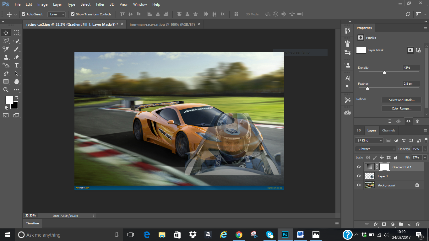
The next thing I will be trying to do is to
change the
yellow painting on the UCP building
(wall and edge) to my desired colour and
write
using text tool on it.
I used quick selection tool to select the area I
will like
to change its colour and filled it with
colour of my choice using brush tool to
achieve
this image.
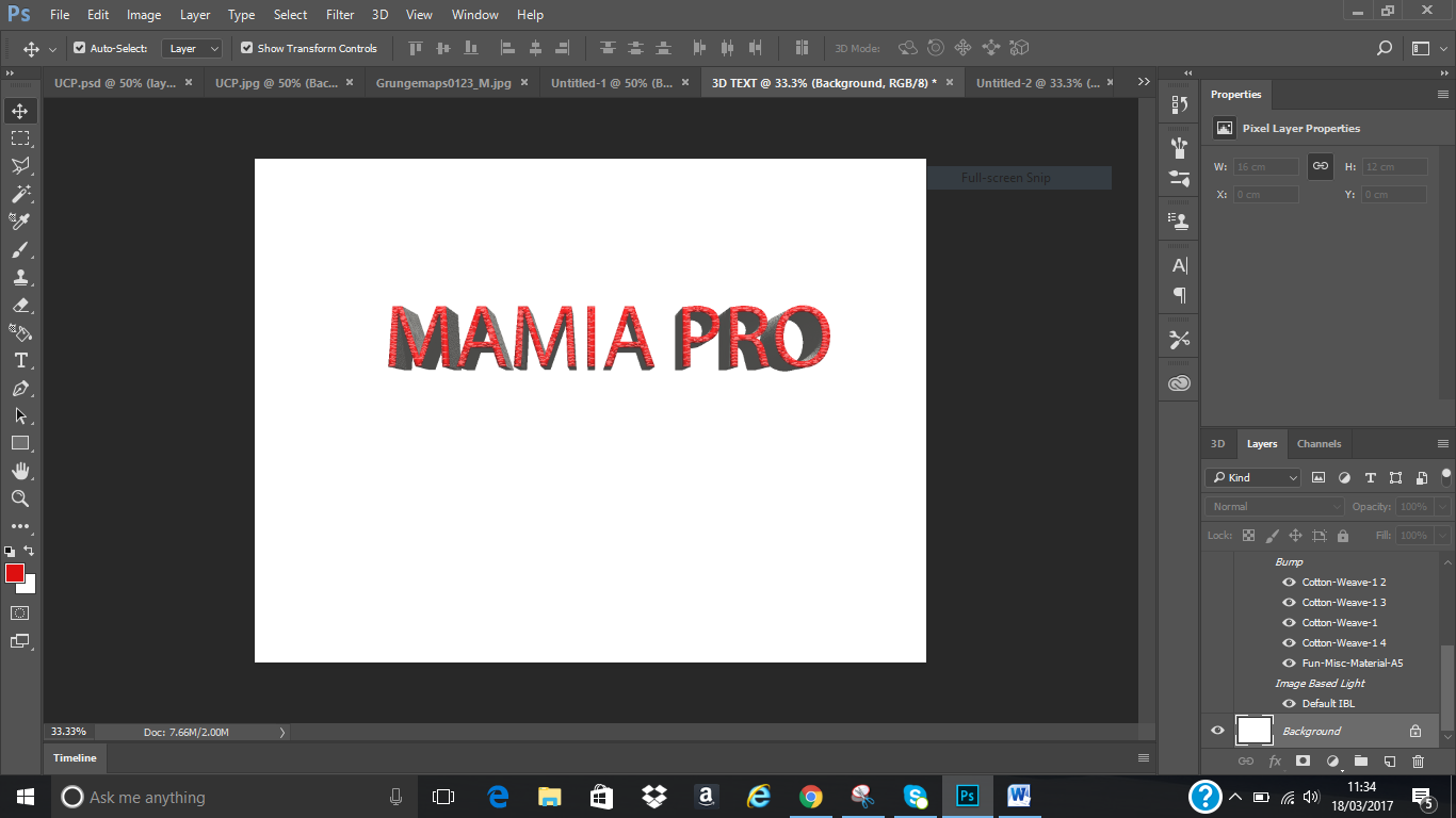
For
the text, after clicking on the text tool, I chose Myriad Pro as text style, 14%
as font size then filled with the colour of my choice. I think of using 3D for
the text. I then right clicked on my
work layer, clicked on the new 3D extrusion from selected layer. I used the
shape Preset on the right side of the Photoshop to select the shape I wanted. I
actually browse through all to see the effect on the text before I finally decided
to choose inflate then adjusted the text by using extrusion depth which was set
to 2cm after checking how the text look like using different figures.
I played around the text to check how the top, back and sides look like before
leaving it on default. I filled the front with fun textured 2(red), reflection
was set to 38%, shine 5%, roughness 22% and bump to 10%. Filled the side (pro
extrusion material) with fabric denim, back inflation with fabric leather
(brown)
Finally, I clicked on the background layer to
achieve this image on the right.
Before I was able to achieve the writing on the wall above, I tried some writings to see how I can do it on the wall. These are the practice I did before doing it on the wall.
Before I was able to lay my hand on the writing, I watched tutorial on youtube so as to be able to get how to do the text.
The link to the youtube I watched is given below:
https://www.youtube.com/watch?v=PS-S45Xt-NU