Wednesday, 26 April 2017
BASIC SHAPES IN ADOBE ILLUSTRATOR
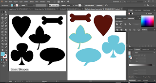
This
is the first practice did on adobe illustrator. The shapes on the left are the
basic shapes given while the shapes on the right are the practice done. This was
given for practice on how to use pen tool, add anchor point
tool, delete anchor point tool, rectangular tool and ellipse tool.
MOBILE APP BANNER
For
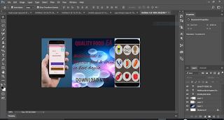
the mobile App banner, the measurement used was 600 by 300px. Duplicating the background
layer and filling the new layer with the background of my choice, I was able to achieve the image on the right.
I decided to put the mobile app on an android phone and interface from adobe illustrator on another. The two was arranged on the opposite sides of the banner (each done on different layers).
The texts were written using text tool on different layers to achieve the picture shown.
I decided to put the mobile app on an android phone and interface from adobe illustrator on another. The two was arranged on the opposite sides of the banner (each done on different layers).
The texts were written using text tool on different layers to achieve the picture shown.
Tuesday, 25 April 2017
ADOBE ILLUSTRATOR FIRST LOGO
I do not know how my first logo in illustrator actually gone from my blog. Anyway, I will be blogging about the new one I made to replace it.
This is the first logo I made. The measurement used for the work area is 5x8 inches. Choosing the colour of my choice and setting the stroke to 5pt, I made two rectangles one on top of the other then aligns to the centre to make sure they are centralised. Making another rectangle for the teeth of the fork, I made one and copied it for the remaining teeth to make sure it has the same shape size. After, I clicked on align vertical top after selecting to make sure the 3 teeth are aligned at the top then horizontal distribute centre to make sure there is equal space in between them.
I grouped them by right clicking and selecting group then moved the three joined rectangles down to meet the one drew earlier. Getting the pathfinder from window, I selected all and clicking on unite I was able to make a shape.
Selecting all, clicking on effect > stylise > round the corner (radius 0.25), I was able to achieve this shape after previewing and satisfied with the shape.
For the spoon, using rectangle shape for the bottom, ellipse for the top and aligning them to the centre. The pathfinder is used to unite. Then effect > stylise > round the corner to get the picture on the right.
For the fork, rectangle shape was used for the handle. Clicking on the pen tool and selecting add anchor point tool, I was able to make two points from the top and not too close to each other. Using direct selection tool and dragging the topmost point out gives the bulge edge of the knife. I can actually use ellipse for the knife cutting side but decided to use another tool instead of repeating same shape.
Using select anchor point I was able to adjust the pointed tip to round tip. After, I clicked on effect > stylise > round the corner to give it round the corner effect.
For the overall logo, the star was gotten from star tool; the background was made by using rectangular tool and filling with the colour of choice. The chef hat was made with ellipse and rectangular shape and using unite in pathfinder to unite them. Text was used to make the writing.
Friday, 21 April 2017
MOBILE APP
Clicking
on file > new > mobile > android 1080p
(1080 x 1920px @ 72 ppi) to set the blank document for use. Filled it with colour of choice then used rectangular tool to divide the top part gives the image as seen on the right hand side.
(1080 x 1920px @ 72 ppi) to set the blank document for use. Filled it with colour of choice then used rectangular tool to divide the top part gives the image as seen on the right hand side.
Using adobe illustrator, I was able to make battery icon. Using rectangular tool, make two rectangle shapes (one small, one big). Adjusted the corners to be rounded and making sure they are vertically align, place them together using arrow key on the keyboard to achieve this....
Filled with white to denote fully charged battery, then used pen tool to draw the triangle for the signal sign and ellipse + pen tool for the cone representing the Wi-Fi. All the drawings was arranged accordingly on the first image.
When that is done, I then duplicate the entire rectangular image created into four. Naming it accordingly as: home page, log in page, log in page 2 and log in page 3. On the home page, there is a logo and how to sign in. The home page is actually the introductory page showing clients what is needed to be done to get offers.
On the
log in page is example of what can be bought in the restaurant. There is also Vouchers
available, Menu and Restaurant finder. The meal was gotten from the web (www.searchlock.com). The fruit was gotten
from my adobe illustrator work.
The
next page is log in page 2. This shows the breakfast menu available. Drop down
icon gives way to example of food under each. Log in page 3 shows the type of food under breakfast butty.
Using
rectangular marquee tool to select the home page of the mobile app, then
clicking on edit > copy merge > paste. I was able to put the home page on
a phone screen. The phone screen was gotten from Photoshop web.
Same process was repeated for
the remaining pages.
Friday, 7 April 2017
ETHICS OF PHOTOSHOP
Can we ever trust or believe
everything we see in a picture/photograph? How do one known whether a
photograph is original or not manipulated? Does the picture seen portray the
true image in it?
I have actually come across many
people being accused of cheating or manipulating pictures especially
journalists. Making use of Photoshop to perform wonders is what I personally
see as taste. Following the adage that says; “beauty is in the eyes of the
beholder”. That is the same way I see the application of wonders of Photoshop
to an image.
Considering a life time occasion
like marriage ceremony, the photographs taking are for good memories and meant
to be kept for long period of time. If one or two spots are removed from the
face of the couples to make the picture more beautiful, to my opinion it is
fine. But if one of the couples is adjusted from being slim to a big person
then that I will call deceiving. Making photo adjustment to deceive or for
money making purpose is wrong.
Deceiving people with photographs
has been in existence for long even before the existence of Photoshop.
This happened in 1970. The
original pictures are the separate two below. The manipulation was the one the
two were, standing beside each other. The picture was used for a campaign back
then. Although it was acceptable but the truth is it was merged together for the
purpose of the campaign which people believe it was real and original. (Picture
from VLE)
How
could a caterer make a so smooth and clean
cupcake straight from the oven
(second picture)? I
will personally like to meet such. Looking at the 2
cake pictures, the first is the original picture of
a homemade cupcake while the first
was a
manipulation. The second picture is so pleasant to
eyes and encouraging
though. (Picture from VLE)
My conclusion, “not everything
that glitters is gold”. If a picture is so pleasing to the eyes one should
think twice and know what to believe. Life as a whole is deceiving.
CONTENT AWARE MOVE TOOL
The above image is the original image used which was gotting from VLE. I used content aware move tool to interchange the two vans position and using
healing brush tool and patch tool to sand fill the land I moved it from as taught in class. Resulting in the image below.
OLD MAN TO YOUNG MAN
The above image is the image used which was gotten from VLE.
Using healing brush tool, I alt clicked on the
smooth part of the face to select the area then
clicking on the wrinkled area a little at a time to
remove the wrinkles and apply the smoothness.
To make the hair darker, I duplicated the background layer by clicking layer > duplicate layer. On the new layer, I clicked on image > adjustment > replace colour. By clicking on eyedropper tool (+) to select the area which I will like the colour to be applied and selecting it on the image which turn the area to white in the preview. Then clicking on the result to select the colour to apply which adjusted the hue and saturation. Then click okay to close.
By adding a mask to the layer and using soft black
brush to erase the remaining part except the hair I was able to achieve this image on the right
RETOUCHING 2
Got
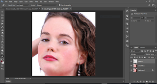
the same picture as previous. Using spot healing brush make it possible to
remove the spots on the face. After which healing brush was applied. To apply
the healing brush, after selecting the brush alt click on the smooth path of
the face then start clicking on the face to apply it. I then choose a soft
brush and colour of my choice to apply lipstick on the lips.
Seeing
that the colour is too bright on the lips, I selected soft light from the colon
beside opacity to give it this amazing lip colour.
The same process as above was repeated for the
eyebrow to achieve this
The same process as above was repeated for the
eyebrow to achieve this
RETOUCHING
The image used was gotten from VLE.
Firstly, after upload, I duplicated the background
layer twice by clicking control J. I closed the layer
visibility for layer 1 copy and make the layer 1 and
background layer visible. Then selecting layer 1, I
clicked on filter > blur > Gaussian blur to set the
radius to 1.8 then make layer 1 copy visible and
selecting it.
After selecting layer 1 copy, by
clicking on image > apply image and setting the layer to layer 1, blending
to subtract, leaving scale and offset as it is, I then clicked ok.
Selecting
layer 1 again and using lasso tool to select small area of the forehead, then
filter > blur > Gaussian blur to increase the radius a little more to 3.3
from 1.8, the area was fine tuned and made clear of blemish. Selecting the face
randomly and repeating the process by clicking on Gaussian, I was able to achieve
the image on the right hand side.
Using
this method make the face looks a bit fake. Which make me to decide to use another
method and compare the two images. See you in the next practice.
Subscribe to:
Comments (Atom)


